


































Skip to content
NEOGOV Logo

Brand Standards

Following our brand guidelines keeps communications consistent with our purpose, maintaining the high standards of the NEOGOV experience. 

PRIMARY
NEOGOV Logo

NEOGOV’s main logo is the cornerstone of our identity, 
and should be used whenever space, layout, and legibility allow.

Reverse
NEOGOV Logo - White

For use on solid-color backgrounds, or on images with an overlay, where the color logo would create a contrast ratio of less than 4:1.

Single Color
NEOGOV Logo - Single Color

For use when the number of colors for a piece is limited, such as on swag or embroidery, or when the full-color logo is placed on a background that would make the contrast ratio less than 4:1.

Logo Prohibitions

Never alter our logo in any way. Do not re-color, skew, stretch, slant, warp, crop or tilt the logo. Never add an effect such as a drop-shadow, gradient, or stroke.

Always ensure the logo maintains minimum contrast (4:1) with the background, and never place it over a busy background photo or texture.

Minimum Scale

The smallest size a NEOGOV logo should be is 150px wide to ensure clarity and recognition.

NEOGOV Logo Minimum Scale is 150px Wide


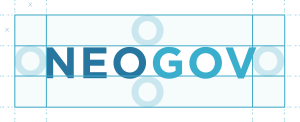
NEOGOV Logo with Exclusion Zone

Exclusion Zone

The Exclusion Zone - shown above - is equal to one NEOGOV "O". This space ensures the legibility and impact of our logo by isolating it from competing visual elements such as text and supporting graphics. This zone should be considered as the absolute minimum safe distance, in most cases the logo should be given even more room to breathe.

BRAND FAMILY

Logos for Other NEOGOV Brands

PRIMARY
NEOED-Logo-FullColor

NEOED’s main logo is the gold standard for this brand, 
and should be used whenever space, layout, and legibility allow.

REVERSE
NEOED-Logo-White

For use on solid-color backgrounds, or on images with an overlay, where the color logo would create a contrast ratio of less than 4:1.

SINGLE COLOR
NEOED Logo - Single color

For use when the number of colors for a piece is limited, such as on swag or embroidery, or when the full-color logo is placed on a background that would make the contrast ratio less than 4:1.

PRIMARY
PowerDMS Logo

PowerDMS’s main logo is the gold standard for this brand, and should be used whenever space, layout, and legibility allow.

REVERSE
PowerDMS Logo - White

For use on solid-color backgrounds, or on images with an overlay, where the color logo would create a contrast ratio of less than 4:1.

SINGLE COLOR
PowerDMS Logo - Single Color

For use when the number of colors for a piece is limited, such as on swag or embroidery, or when the full-color logo is placed on a background that would make the contrast ratio less than 4:1.

COLORS

Unified Primary Palette

These are the main colors for the entire family of NEOGOV brands.

ANCHOR

Graphic Elements
HEX #27769F
RGB 39 / 119 / 159

HORIZON

Graphic Elements
HEX #3AAECD
RGB 58 / 174 / 205

SKY

Backgrounds,
Graphic Elements

HEX #C4EBF7
RGB 196 / 235 / 247

Unified Secondary Palette

Supporting colors for backgrounds, buttons, and text.

MIDNIGHT

Background, Text
HEX #14333E
RGB 20 / 51 / 62

Sand

Backgrounds
HEX #FAF7F6
RGB 250 / 247 / 256

White

Backgrounds, Text
HEX #FFFFFF
RGB 255 / 255 / 255

Flash

Buttons, Calls to Action
HEX #4FDBFF
RGB 79 / 219 / 255

Soft Black

Text
HEX #333333
RGB 51 / 51 / 51

BRAND FAMILY

Accent Colors

Beacon

Backgrounds
HEX #FAF7F6
RGB 247 / 165 / 53

DAWN

Backgrounds
HEX #F6CD34
RGB 246 / 205 / 52

SHORE

Backgrounds
HEX #FEF0C7
RGB 254 / 240 / 199

VISTA

Backgrounds
HEX #0AA28D
RGB 10 / 162 / 141

LAGOON

Backgrounds
HEX #10CCB2
RGB 16 / 204 / 178

VAPOR

Backgrounds
HEX #CBF1EC
RGB 203 / 241 / 236

FLARE

Backgrounds
HEX #E04D12
RGB 224 / 77 / 18

BLAZE

Backgrounds
HEX #EE7029
RGB 238 / 112 / 41

HARBOR

Backgrounds
HEX #F8A97E
RGB 248 / 169 / 126

TYPOGRAPHY

Brand Font

Our primary brand font is Nunito Sans, a variable font available on Google Fonts. This font is used for all of our body text, including headers. Nunito Sans is a calm, well-balanced humanist sans-serif typeface with a full set of widths from ExtraLight (200) to Black (900).

Headline 1

Headline 2

Headline 3

Headline 4

Headline 5
Headline 6

Paragraph

ICONOGRAPHY

Product Icons

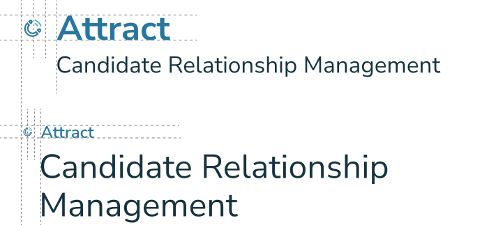
All icons are 2-color combinations of Anchor and Horizon. Do not alter the icons in any way.

Placement

Placement is always to the left of the product name, aligned to the baseline and the same height as the text, no larger than 100px. Clear space (margin) is half the width of the icon. If positioned with other text, align additional text with the product name, not the icon.

Product Icon Placement Guide

General Icons

Google Material Icons should be used for icons that are not product-specific. Only use icons in this library with these settings:

Fill: Off    Weight: 300    Style: Rounded 

Icon Color Usage

Always Approved Colors

These color combinations are approved for icons in any setting. They are primary colors for all brands and meet contrast minimums for 508c.

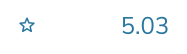
Icon-Example-Anchor&White

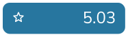
Icon-Example-Anchor&WhiteReverse

Icon
Anchor
#27769F

Background
White
#FFFFFF

Icon
White
#FFFFFF

Background
Anchor
#27769F

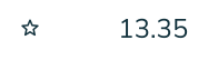
Icon-Example-Midnight&White

Icon-Example-MIdnight&WhiteReverse

Icon
Midnight
#14333E

Background
White
#FFFFFF

Icon
White
#FFFFFF

Background
Midnight
#14333E

Decorative Only Colors

These colors may be used strictly if aesthetic or redundant (when adjacent text already explains the feature). These do meet contrast minimums for menus, interactive elements, or information without text. 

Icon-Example-Horizon&White

Icon-Example-Horizon&WhiteReverse

Icon
Horizon
#3AAECD

Background
White
#FFFFFF

Icon
White
#FFFFFF

Background
Horizon
#3AAECD

Icon-Example-Beacon&White

Icon-Example-Vista&White

Icon
Beacon, Vista, or Flare

Background
White  #FFFFFF
PHOTOS

Authentic Brand Images

Creating a successful brand starts with our customers, which come in all shapes, sizes, races, and ages. Photographs should always strive to reflect that diversity, as well as feel authentic and relatable.

All images should be full color, and focus on real, professional people in real work situations. Cheesy, posed stock photos and clip-art/illustrations are to be avoided in all cases, as are images that show outdated paper processes like handed-in resumes or printed-out charts. 

Click through our brands to see examples of acceptable images.

TAXONOMY

Brand Naming Conventions

NEOGOV is a platform for Public Sector HR. It is the parent brand of several other brands, and stands alone when mentioned. When talking about our suite of products, we always refer to them as a platform, or "the NEOGOV Platform".

When mentioning subsidiary brands, the first mention of these brands should include "by NEOGOV" (ex. "PowerDMS by NEOGOV"...). 

Product names are proper nouns and always capitalized.

When mentioning a single NEOGOV product, use the term NEOGOV [Product] in the first mention of a body of text (ex. "NEOGOV Perform").

After that mention, just use [Product] (ex. "Perform").

NEOED, a subsidiary brand of NEOGOV, is a platform for Education HR. When first mentioning this brand in a body of text it should be introduced as "NEOED by NEOGOV". Further mentions can be "NEOED" or "the NEOED Platform".

Products for NEOED follow the same text conventions as NEOGOV. Product names are proper nouns and always capitalized. Use the term NEOED [Product] in the first mention of a body of text. After that mention, just use [Product].

PowerDMS, a subsidiary brand of NEOGOV, is a platform for public safety. When first mentioning this brand in a body of text it should be introduced as "PowerDMS by NEOGOV". Further mentions can be "PowerDMS" or "the PowerDMS Platform".

Products for PowerDMS follow the same text conventions as NEOGOV. Product names are proper nouns and always capitalized. Use the term PowerDMS [Product] in the first mention of a body of text. After that mention, just use [Product].